 Block Set date/time
This control element shows the time of the controller and sets date and time there – for instance if the controller cannot get its time from the internet. Switching clocks and all time dependent functions follow this time.
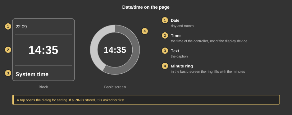
A tap opens the dialog for setting. If a PIN is stored, the new block design asks for it only when the time is set, that is on the first tap on a field or on Apply, and it stays valid until the dialog is closed. The previous design asks for it before the dialog. A wrong entry shows “Wrong password”.
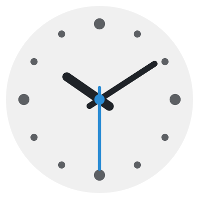
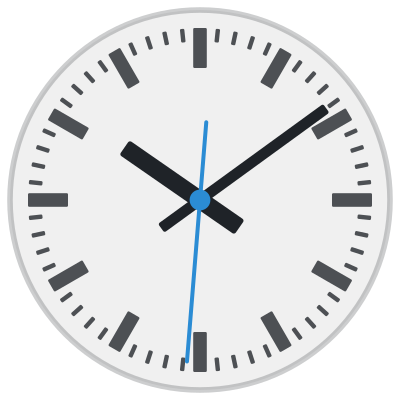
In the new block design the element can show the time on a clock face:
The second hand appears only if Seconds is switched on. The colors come from the style. In the basic screen only the round clock stands on the page, with an opaque face and without a tile.
The gear in the dialog opens the view, even without a PIN: Analog clock, Clock face, Clock as large as possible, Also show digital time and Seconds. Save applies the selection. It applies only to this element on this device, other devices keep their view and the controller does not learn about it. Project default returns to the settings of the installer.
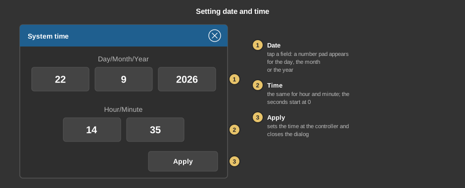
If the dialog is closed without Apply, the time of the controller stays unchanged.
This section is meant for the installer of the system.
No function block is needed, the element talks directly to the controller.
The properties show only the parameters that take effect in the selected display and view.
Display |
|
| View | Block or Basic screen. The third choice List (obsolete) comes from older projects and should no longer be used. |
| Text | Caption of the tile. Its size scales with the element, a line break is inserted with \n, two lines at most. Default “Systemzeit” (system time). |
| Seconds | Shows the seconds below the time, in the basic screen as an inner ring, on the analog clock as a second hand. Small tiles show only the time in the digital display, the parameter does not appear there. Default off. |
Design (new) |
|
| Display | Digital or Analog. Only in the new block design, in the previous design the element always shows digits. Default Digital. |
| Clock face | Plain or Classic. Only with display Analog. Default Plain. |
| Clock as large as possible | On: The clock fills the tile, the date stands small below it, no digital time. Only with display Analog in the view Block; in the basic screen the clock is always as large as the element. Default off. |
| Also show digital time | On: Time and date stand below the clock. Off: Weekday and date stand below the clock. Only with display Analog in the view Block, without Clock as large as possible. Default on. |
Security |
|
| PIN | Optional, four digits. Protects setting the time: the new block design asks for it on the first tap on a field of the dialog, the previous design before the dialog. Empty: no PIN. |
See also General properties of all control elements.